Week 5 - Unit Tests, Profiling, Layouts, and Widgets
Corresponding Text
http://developer.android.com/training/testing/unit-testing/index.html http://developer.android.com/tools/performance/index.html Android Programming, pp. 149-166
Unit Tests
While it might seem reasonable to manually test features of an app while the app is relatively small, as we add features manual testing becomes time-consuming and prone to error. Ideally, we should automate our testing whenever possible.
Unit tests verify the functionality of a small piece of code: a method, a class, or some other component. For example, if we have a class representing contact information that stores a name and email address, we might want to test the ability to assign a name and email address and the ability to retrieve these values.
We can create and automate unit tests for our apps. There are two types of unit tests that we can create: local tests and instrumented tests. Local tests don't depend on the Android framework or instrumentation information. Local tests can be run locally on the JVM. Testing something like a class to store contact information would likely make use of local tests. Instrumented tests are unit tests that require an Android device or emulator to run. For example, if we wanted to test our apps ability to start another activity, we might create an instrumented test. If we'd like to test some code that depends on the Android framework, we also have the option of using local tests if we mock the components of Android that we need. A mocked object is an object created to simulate the behavior of another object. For example, we might want to test some functionality that depends on a Bundle; rather than write an instrumented test, we can write a local test if we mock Bundle.
Setup
We're going to focus on local tests. To create and run our tests, we'll make
use of some testing frameworks: JUnit, Mockito, and PowerMock. This will
require that we explicitly indicate to the build system, Gradle, that our
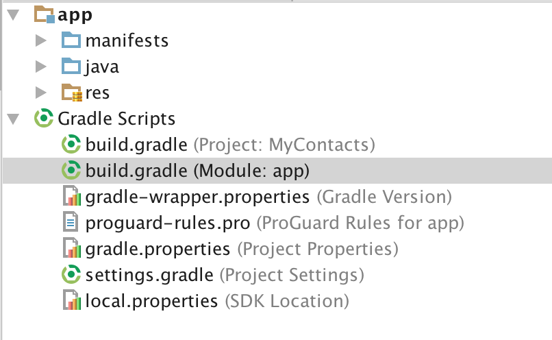
project depends on these frameworks. To do this, we'll modify the module's
build.gradle file.
The dependencies section should look similar to this:
dependencies {
    compile fileTree(dir: 'libs', include: ['*.jar'])
    androidTestCompile('com.android.support.test.espresso:espresso-core:2.2.2', {
        exclude group: 'com.android.support', module: 'support-annotations'
    })
    compile 'com.android.support:appcompat-v7:25.0.1'
    testCompile 'junit:junit:4.12'
}
Notice that there's already an entry for JUnit. Let's add entries for Mockito and PowerMock. The dependencies section should now looks like this:
dependencies {
    compile fileTree(dir: 'libs', include: ['*.jar'])
    androidTestCompile('com.android.support.test.espresso:espresso-core:2.2.2', {
        exclude group: 'com.android.support', module: 'support-annotations'
    })
    compile 'com.android.support:appcompat-v7:25.0.1'
    testCompile 'junit:junit:4.12'
    testCompile 'org.mockito:mockito-core:1.10.19'
    testCompile 'org.powermock:powermock-api-mockito:1.6.6'
    testCompile 'org.powermock:powermock-module-junit4:1.6.6'
}
Once the additional dependencies are added, you should be prompted to sync Gradle.
Creating Tests
When viewing the structure of our app in the Android view, we can see three different packages, one that contains the classes we've created for our app and two that contain test classes.
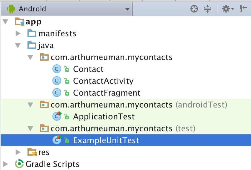
If we view the structure as a typical Java project, we can see that these three
different packages are located in different folders within the src folder.
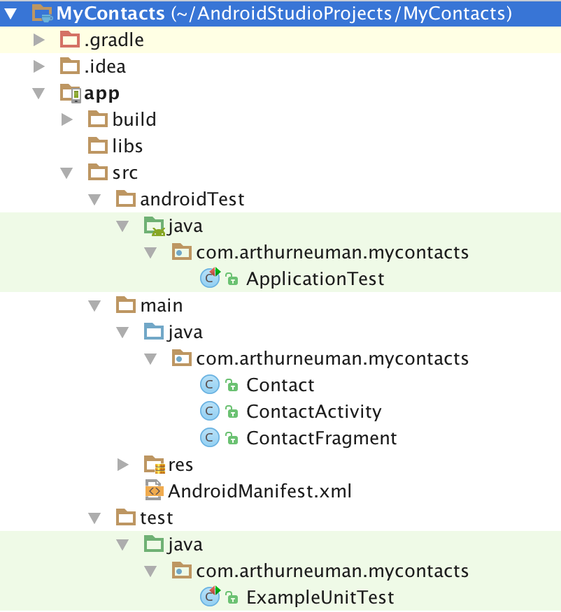
We'll add our local tests to the test folder and instrumented tests to the
androidTest folder.
Notice that there is a simple example of each kind of test in each folder. Let's add a local test.
Right-click on the test package/folder and select New and Java Class.
Name the new class ContactTest. Let's start by first importing a couple of
classes:
import org.junit.Test;
import static org.junit.Assert.assertEquals;
The org.junit.Test class will be used as a decorator to indicated that a
method represents a test. assertEquals will be used to determine if the
test passes or fails. We can define tests for the getters and setters of
the Contact class. If the getters and setters of the Contact class depend
on any component of the Android framework, such as Log, the following
examples will not work; comment out any Android-dependent functionality, create
different tests, or see the details of mocked tests below.
The following are two tests for the accessor methods in the Contact class:
public class ContactTest {
    @Test
    public void contactNameTest() {
        String name = "Test Name";
        Contact contact = new Contact();
        contact.setName(name);
        assertEquals(name, contact.getName());
    }

    @Test
    public void contactEmailTest() {
        String email = "[email protected]";
        Contact contact = new Contact();
        contact.setEmail(email);
        assertEquals(email, contact.getEmail());
    }
}
In the ContactTest class we define two tests: contactNameTest() and contactEmailTest(). In each test we set a value for a string, create a new instance of the Contact class and use the appropriate setter. In each test, we assert that something must be the case in order for the test to pass: that the string we created is equal to the value returned by the appropriate getter.
To run the tests, we can either right-click on the ContactTest.java file and
select Run 'ContactTest' or right-click on the "test" folder and select
Run 'Tests in 'mycontacts''. In either case, if the tests pass, we should
see a message indicating that the tests passed.
If we modify the behavior of the Contact class so that the expected value of getName() or getEmail() is not returned, we'll see a message indicating that a test failed and an AssertionError indicating exactly which test failed.
Let's add one more test to ensure that newly created instances of Contact have non-null IDs:
    @Test
    public void UUIDcreationTest() {
        Contact contact = new Contact();
        assertNotNull(contact.getID());
    }
If Contact had more complex functionality, we could define additional tests to verify that Contact behaved in the expected manner.
Mocking Android Dependencies
By default, when we run our tests, they are executed with a modified version
of the android.jar file that normally contains code for the Android
framework. The modified version will throw an exception when we attempt to
use any Android classes or methods - this ensures we are testing our code and
not implicitly relying on Android functionality. However, some of our code
will be tightly coupled to the Android framework and will require certain
Android classes to test.
As a somewhat trivial example, suppose ContactActivity includes a method for getting the package name from a Context object:
    public String getPackage(Context context) {
        return context.getPackageName();
    }
Suppose we wanted to test this. Because it depends on Context, a class from the Android framework, the test would fail with an exception if we wrote it like our previous test. Instead, we have to mock the Context class. By mocking it, we have to define its methods' behaved as necessary. Specifically, we'll need to define behavior for Context.getPackageName().
Here's the complete test class:
@RunWith(MockitoJUnitRunner.class)
public class ContactActivityTest {
    private static final String PACKAGE_NAME = "com.test.mycontacts";

    @Mock
    Context mContext;

    @Test
    public void contactFragmentCreationTest() {
        when(mContext.getPackageName()).thenReturn(PACKAGE_NAME);
        ContactActivity contactActivity = new ContactActivity();
        String packageName = contactActivity.getPackage(mContext);
        assertEquals(PACKAGE_NAME, packageName);
    }
}
First, we have to annotate our class with @RunWith(MockitoJUnitRunner.class)
which will cause Mockito to process/run the test rather than JUnit directly.
Next, we specify the Android classes we'll mock using the the @Mock
annotation. We define the behavior of the mocked objects using the
when(...).thenReturn(...) construction to specify the return value when a
specific method is called. In the example, we then create an instance of
ContactActivity and call the getPackage() method with the mocked
context. If things behave as expected, the value returned by
ContactActivity.getPackage() should be the same as the value returned by
the Context, which we defined. This trivial example would throw an exception
if we didn't create a mocked Context class.
A weakness of Mockito is that we cannot use it to mock static methods like those we'd use from the Log class. We can use PowerMock to do this. Recall that when we updated the app's dependencies, we added two PowerMock libraries. One is used to integrated PowerMock with JUnit and the other to interact with Mockito. This allows us to make minimal changes to existing tests to incorporate PowerMock functionality. As an example, modify the contactActivity.getPackageName() method to include code that generates a log message.
public String getPackage(Context context) {
    Log.d(ContactActivity.class.getSimpleName(), "Getting package name");
    return context.getPackageName();
}
Running the existing test using Mockito will fail. Using PowerMock, we can indicate that we'll need to mock the Log class using the PrepareForTest class annotation and the PowerMockito.mockStatic() method within a test. We'll also have to update the RunWith class annotation to use PowerMockRunner. Here's the updated test using PowerMock:
@RunWith(PowerMockRunner.class)
@PrepareForTest(Log.class)
public class ContactActivityTest {
    private static final String PACKAGE_NAME = "com.test.mycontacts";
    @Mock
    Context mContext;

    @Test
    public void contactFragmentCreationTest() {
        when(mContext.getPackageName()).thenReturn(PACKAGE_NAME);
        PowerMockito.mockStatic(Log.class);
        ContactActivity contactActivity = new ContactActivity();
        String packageName = contactActivity.getPackage(mContext);
        assertEquals(PACKAGE_NAME, packageName);
    }
}
Profiling
Users expect apps to start quickly and be responsive. As we develop the app it will be important to not only test functionality using unit test but to also examine performance using the profiling tools included with Android Studio.
Performance Monitors
Android Studio includes a collection of tools we can use to monitor resource usage of app. These tools are available in the Android Monitor view. We've already used one of the monitors, logcat, when viewing log messages.
Next to the logcat tab, we can find the Monitors tab. There are four charts that are displayed providing information about usage over time:
- Memory
- CPU
- Network
- GPU
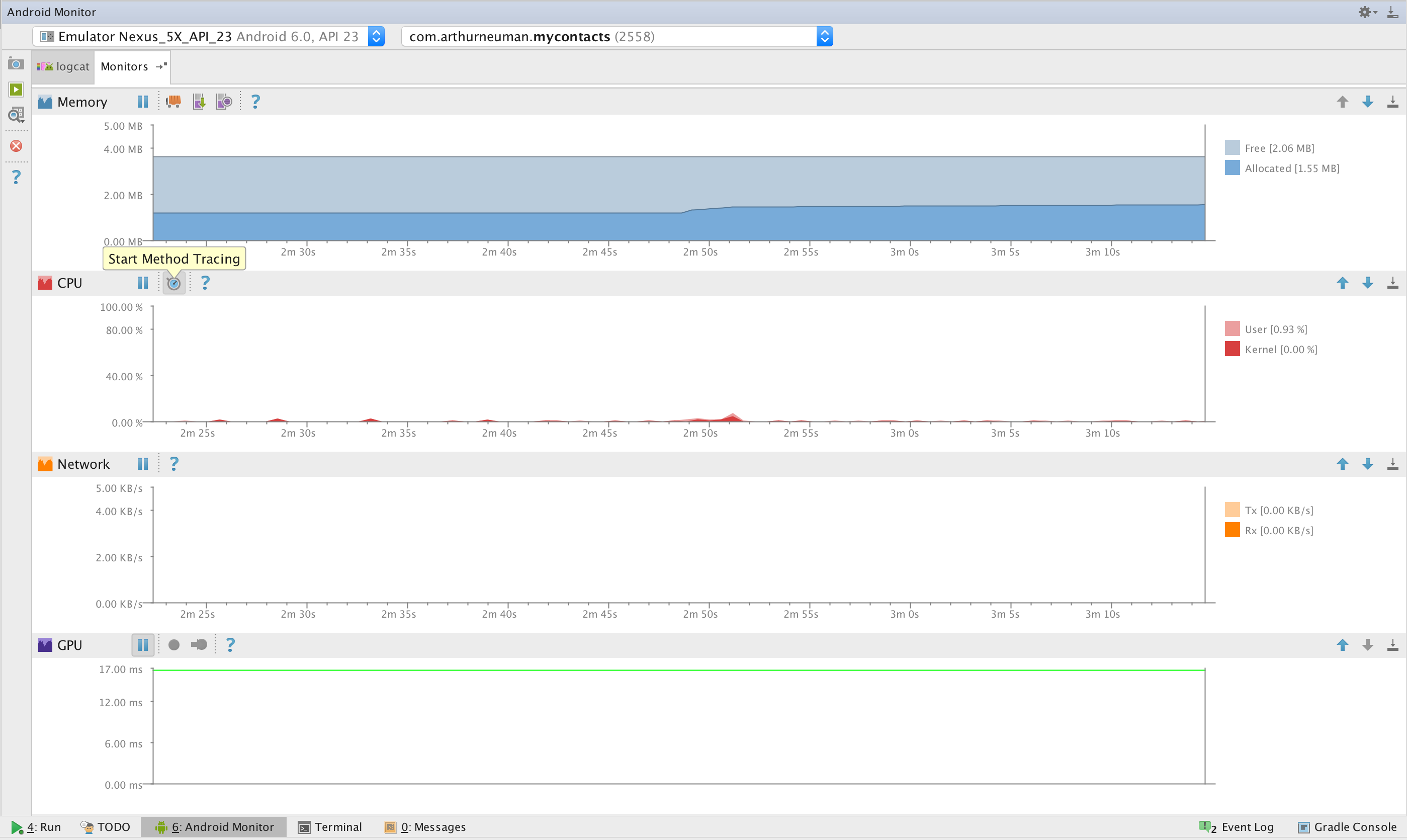
Each chart has a set of tools available for use. The memory chart shows our app's memory usage over time. In addition to being able to track the usage, we can also use the monitor to dump the heap, where all runtime data is stored, to determine what is consuming memory; track memory allocations of objects; and force the garbage collector to run. A common problem, especially when using media, is consuming more memory than is available leading to a crash. The memory monitor and it's tools can help determine what is consuming large amounts of memory.
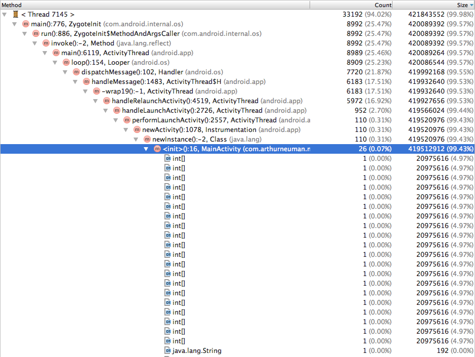
The CPU monitor displays the app's processor usage. Additionally, we can track method execution using the method tracer tool. The CPU monitor is useful if we notice that the app is frequently unresponsive. We might have several long-running methods in different threads or a lot of short-running threads.
The network monitor is useful for tracking network usage. If we find that our app is transmitting or receiving more data than we expect, it might be due to a bug. Given that a lot of users have limited bandwidth, it's important that we track down excessive usage. Similarly, if we expect to connect to an external data source and don't appear the be getting/sending data, we can confirm this using the network monitor.
The GPU monitor indicates the time required to render the apps interface. Unless the app makes use of advanced graphics, we shouldn't expect rendering to take a lot of time. If we have a lot of UI elements, we might see this reflected in the GPU monitor.
To demonstrate a memory leak, consider the following example adapted from Codexpedia.com. First, create a new app with an empty activity. Update the activity to include the following code:
public class MainActivity extends AppCompatActivity {
    private Handler mLeakyHandler = new Handler();
    private int[] mValues = new int[5 * 1024 * 1024];

    @Override
    protected void onCreate(Bundle savedInstanceState) {
        super.onCreate(savedInstanceState);

        // Post a message and delay its execution for 10 seconds.
        mLeakyHandler.postDelayed(new Runnable() {
            @Override
            public void run() {
                Toast.makeText(MainActivity.this,
                        "Number of items: " + mValues.length,
                        Toast.LENGTH_LONG)
                .show();
            }
        }, 1000 * 10);
    }
Here, we are making use of a Handler. A Handler lets us add a Message, a special object to store data, or a Runnable to a queue as well as process objects in the queue. A Handler will allow us to create threads that can interact with the UI. Here, we add a Runnable that displays a message about the size of the mValues array. Because the new thread requires information about mValues, a reference to the object is maintained until the activity is destroyed and the thread has executed.
Now start the app and rotate the device a few times. Eventually, the app should crash. If we view the log messages using logcat, we can see that the app crashed due to a lack of memory. If we restart the app and use the memory monitor while rotating the app, we can see that the app slowly consumes more and more memory until it crashes.

If we wanted to gain more insight into what was using memory, we could track memory allocation by clicking the Start Allocation Tracking button. Once the app crashes, click the button again to see what the memory allocation looked like - we should see multiple int arrays consuming large amounts of RAM.
Though this example exaggerates the issue by initializing a large array , the way the code is written is still causing a memory leak - when the activity is destroyed, due to rotation or something else, the Handler queue is not cleared; this can be done by adding the following to the MainActivity.onDestroy() method:
mLeakyHandler.removeCallbacksAndMessages(null);
Adding Widgets and Updating Layouts
Let's return to the contacts app and add some additional functionality. Eventually, we'll be able to view a list of contacts and it might be helpful to select some contacts as "favorites" and view only favorite contacts. To enable the user to designate a contact as a favorite, we'll add a widget to the contact fragment layout, update the Contact class, and wire the new widget to make changes to the corresponding Contact instance when the widget's state changes.
To begin, let's add a string resource to the string.xml resource file:
<string name="favorite">Favorite</string>
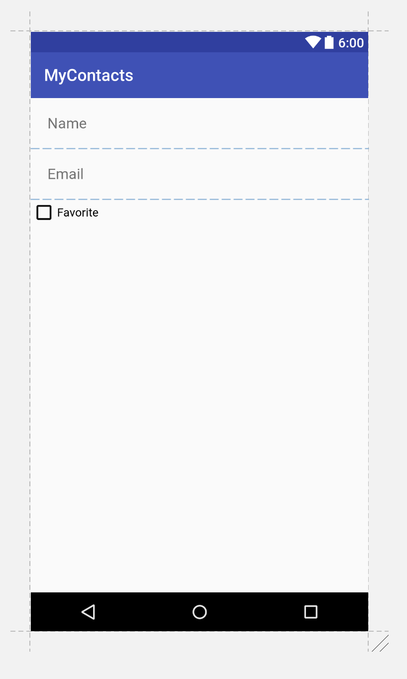
Next, let's add a CheckBox widget to the contact fragment layout. We can add it after the email EditText in the existing LinearLayout by dragging and dropping the widget onto the preview of the layout and settting the following properties:
| Property | Value |
|---|---|
| ID | contact_favorite |
| text | @string/favorite |
While we're modifying the layout, set the following properties on the other widgets:
| Widget | Property | Value |
|---|---|---|
| Name EditText | inputType | textPersonName |
| Email EditText | inputType | textEmailAddress |
Choosing the appropriate input type will affect which keyboard is displayed on screen, suggestions provided, and how input will be displayed (masked when passwords are entered, for example).
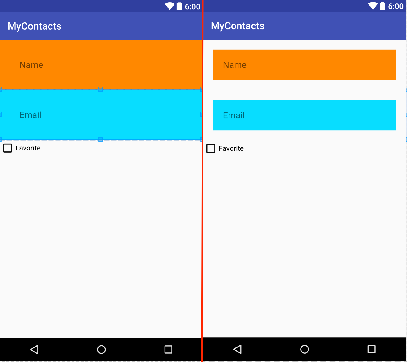
We'll examine the layout further later but for now, it should resemble this:
The XML for the layout should be similar to the following
<?xml version="1.0" encoding="utf-8"?>
<LinearLayout xmlns:android="http://schemas.android.com/apk/res/android"
              android:orientation="vertical"
              android:layout_width="match_parent"
              android:layout_height="match_parent">
    <EditText
        android:layout_width="match_parent"
        android:layout_height="wrap_content"
        android:id="@+id/contact_name"
        android:hint="@string/name_hint"
        android:padding="20dp"
        android:inputType="textPersonName"/>

    <EditText
        android:layout_width="match_parent"
        android:layout_height="wrap_content"
        android:id="@+id/contact_email"
        android:hint="@string/email_hint"
        android:padding="20dp"
        android:inputType="textEmailAddress"/>

    <CheckBox
        android:text="@string/favorite"
        android:layout_width="match_parent"
        android:layout_height="wrap_content"
        android:id="@+id/contact_favorite"/>
</LinearLayout>
To support designating a contact as a favorite, we'll have to update the Contact class to track this information. We can do this by adding a private boolean field and the corresponding getter and setter.
public class Contact {

    ...

    private boolean mIsFavorite;

    ...

    public boolean isFavorite() {
        return mIsFavorite;
    }

    public void setFavorite(boolean favorite) {
        mIsFavorite = favorite;
    }

}
In the code above, the ellipses, ..., represent additional code left out
for brevity.
Now we can add code that will toggle a contact's state of being a favorite based on the state of the widget we added earlier. In the ContactFragment class, we can add a field to represent the favorite CheckBox and set an OnCheckedChangeListener to update the the contact's favorite status.
public class ContactFragment extends Fragment {

    ...

    private CheckBox mFavoriteCheckBox;

    @Override
    public View onCreateView(LayoutInflater inflater, ViewGroup container,
                             Bundle savedInstanceState) {
        View v = inflater.inflate(R.layout.fragment_contact, container, false);

        ...

        mFavoriteCheckBox = (CheckBox)v.findViewById(R.id.contact_favorite);
        mFavoriteCheckBox.setOnCheckedChangeListener(new CompoundButton.OnCheckedChangeListener() {
            @Override
            public void onCheckedChanged(CompoundButton buttonView, boolean isChecked) {
                mContact.setFavorite(isChecked);
            }
        });

        return v;
    }
}
Layout Attributes
Styles and Themes
Now that we've added a widget and code to do something when the widget is used,
let's return to our layout fragment_contact.xml. For each widget defined
in the layout, there are some attributes worth noting beyond what we've made
use of so far.
A style is a resource that contains attributes defining the appearance and behavior of a widget. Styles, like layouts, are specified using XML. For example, the following defines a style named BigBoldStyle.
    <style name="BigBoldStyle">
        <item name="android:textSize">20sp</item>
        <item name="android:textStyle">bold</item>
    </style>
We can define styles in res/values/styles.xml. Be careful when specifying
attribute names - they are case sensitive.
We can use the style by setting a widget's property or by specifying it in the resource XML like this:
 <EditText style="@style/BigBoldStyle"
        android:layout_width="match_parent"
        android:layout_height="wrap_content"
        android:id="@+id/contact_name"
        android:hint="@string/name_hint"
        android:padding="20dp"
        android:inputType="textPersonName"/>
Compare the text in the EditText widgets before and after changing the style.
A theme is a collection of styles. Like a style, a theme can be specified
in the styles.xml file.
Layout Parameters
If we look at the XML representing the layout of our fragment, we can see that
some of the attributes have names that begin with layout_. Parameters that
do not start with layout_ provide configuration information about the widget
itself when the view is inflated. Parameters that do begin with layout_
provide information to the widget's parent about how to arrange the widget
within the parent.
Two commonly confused attributes are margins and padding. Margin attributes are layout parameters: they are used to determine the distance between widgets. Because one widget is not responsible for the placement of a second widget (unless the first is the parent of the second), it is up to the parent to make use of the margin information when placing widgets.
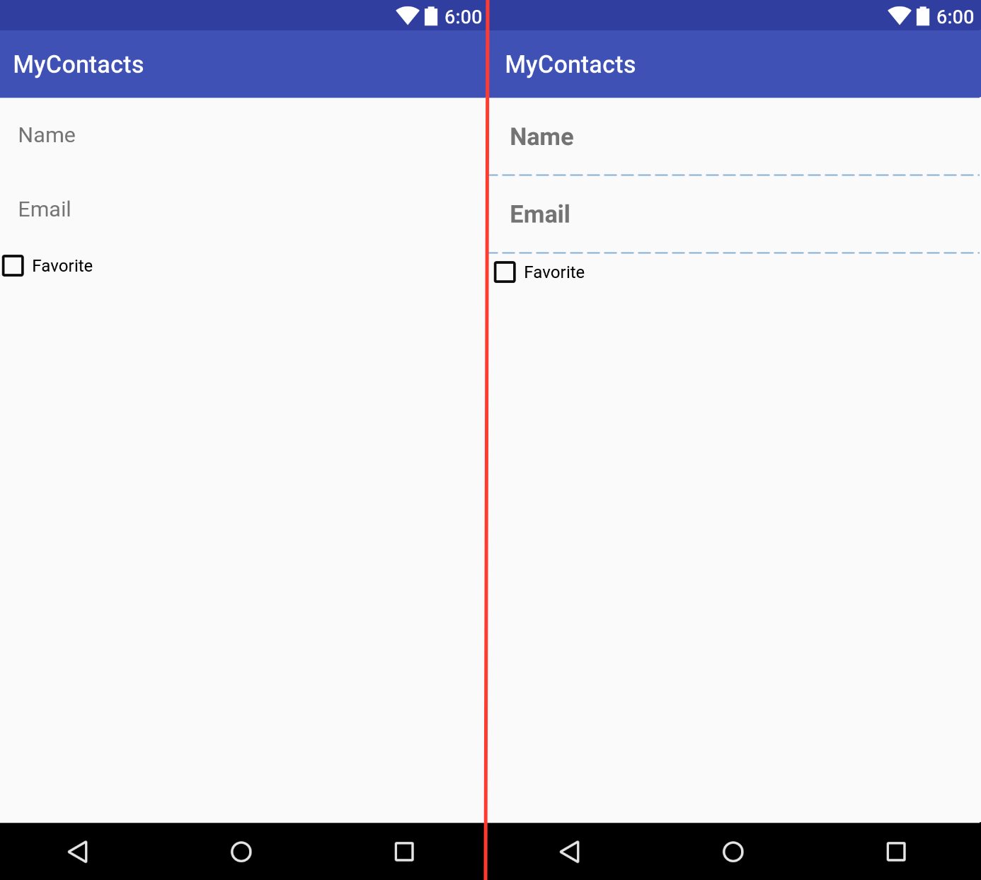
Padding is not a layout parameter, it defines how much larger than its content a widget should be. To demonstrate the difference, let's change the background attributes of the two EditText widgets we have:
    <EditText
        android:layout_width="match_parent"
        android:layout_height="wrap_content"
        android:id="@+id/contact_name"
        android:hint="@string/name_hint"
        android:padding="20dp"
        android:inputType="textPersonName"
        android:background="@android:color/holo_orange_dark"/>


    <EditText
        android:layout_width="match_parent"
        android:layout_height="wrap_content"
        android:id="@+id/contact_email"
        android:hint="@string/email_hint"
        android:padding="20dp"
        android:inputType="textEmailAddress"
        android:background="@android:color/holo_blue_bright"/>
Next, let's double the padding from the default value of 20dp to 40dp.
Notice that the entire widget increased in size (and the text move further
toward the center). The space between the widget's content and its edges
increased when we increased the padding.
Let's reset the padding to 20dp and add android:layout_margin="20dp" to
both widgets. Notice now that rather than the widgets increasing in size, the
space between each widget and other widgets (and the edges of the parent)
increased. The parent layout used the new layout parameter to change the
placement of the widget.
Be sure to revert changes to margins, padding, and the background.
Another layout parameter that we might have to work with is layout_weight.
When working with linear layouts, the layout makes two passes to examine a
widget's layout parameters to place it and other widgets. First, the layout
will look at the widget's height (if the layout is a vertical layout) or the
widget's width (if the layout is a horizontal layout). In the second pass,
the layout will examine the layout_weight attribute to allocate any extra
space. If we add android:layout_weight="1" to the two EditText widgets, we
can see that the layout allocates enough space for each of the widgets then
allocates extra space to widgets with the weight attributes.
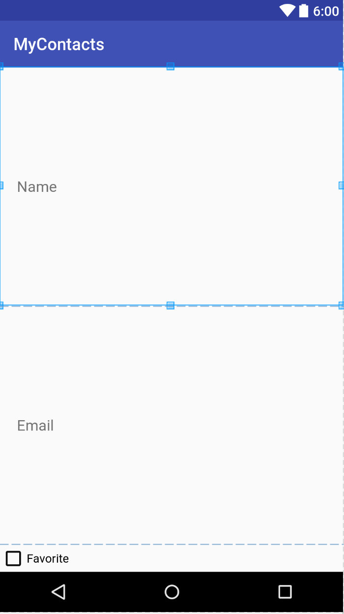
If we double the weight for the first EditText widget, we can see that the first EditText widget has twice the height of the second one - it's been allocated twice the extra space than the second EditText widget.
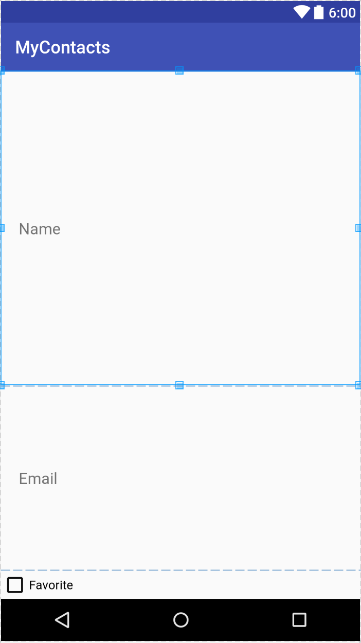
For now, we'll remove the specifications for the layout_weight attributes.
Screen Pixel Densities
When we modified padding of our widgets, you might have noticed that units were
dp. Because Android runs on many devices with difference screen sizes,
Android provides a method of specifying sizes in a way that should produce
similar results across all devices. We make use of this with
device-independent dimension units. We can specify sizes in one of three ways:
| Unit | Description |
|---|---|
| dp | Density-independent pixel - typically used for margins and padding. For higher-density displays, a density-independent pixel will expand to fill a lager number of pixels. By definition 1 dp = 1/160th of an inch on the device's screen. |
| sp | Scale-independent pixel - typically used for text size. These are density-independent pixels that also take a user's font size preference into account. |
| pt, mm, in | Scaled units representing points (1/72nd of an inch), millimeters, and inches. Many devices are not configured to properly scale items specified with these units so they should be avoided in favor of dp or sp. |